Several voices compete
The wide geometric name, serif “Beach Club”, two slogans, palm icon and rules each have their own style and weight. At a glance, there is no obvious order after the name.

A clearer journey to the sea.
A bilingual website proposal for a beach club in Scanzano Jonico. The concept brings the beach, pool, dining and celebrations into one experience that is easier to explore and plan from.
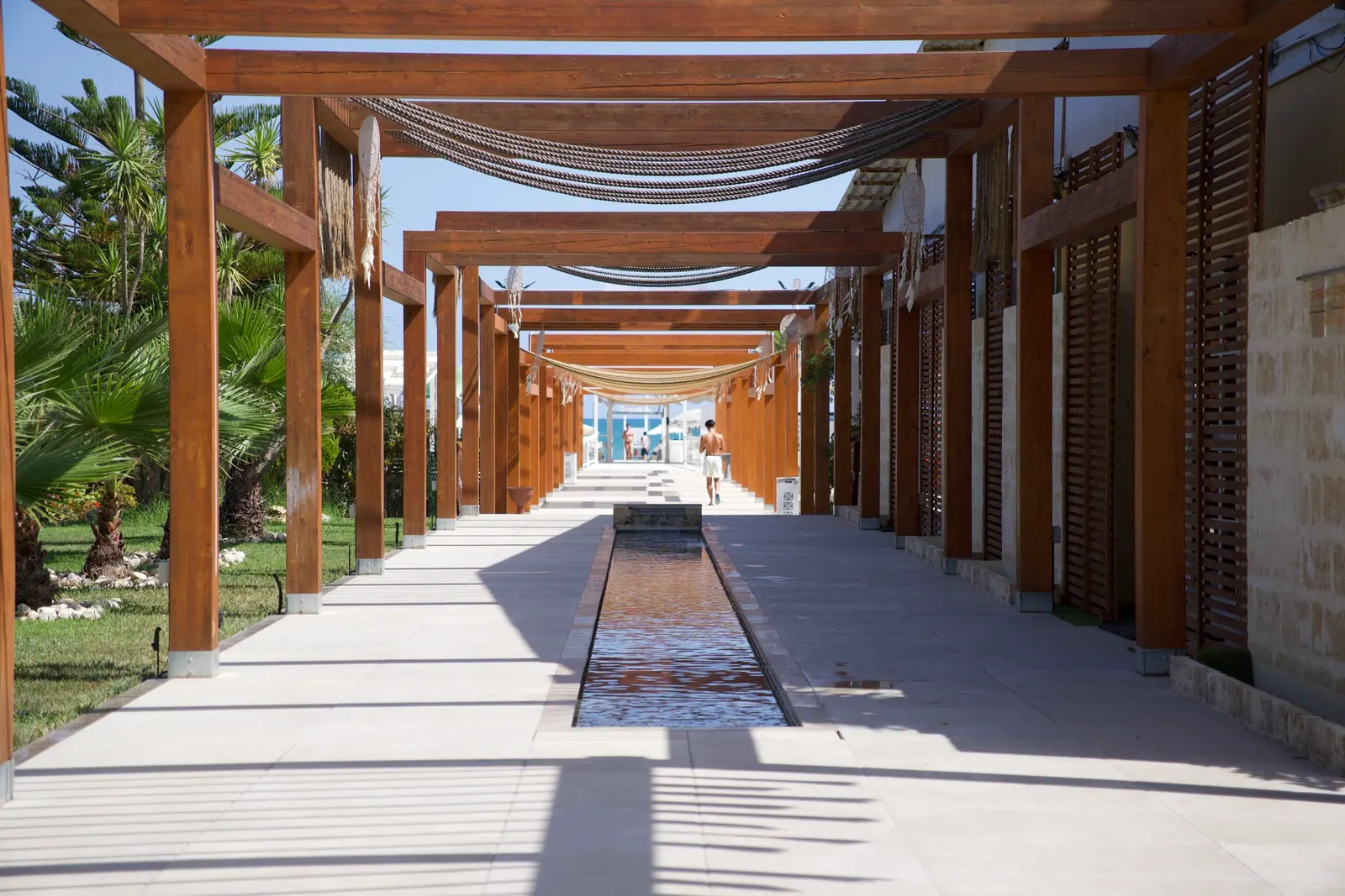
Sabbia d’Oro is a beach club with a pool, places to eat and spaces for events. A visitor might be choosing a day on the sand, a restaurant table or a celebration. The concept needed to give each journey a clear entrance without making the business feel like a collection of separate websites.
Sabbia d’Oro is an evocative name, and the sand colour and palms make the beach-club category clear. The issue was not a lack of recognition. It was that the mark asked the viewer to read several messages at once before anything about this particular place came through.
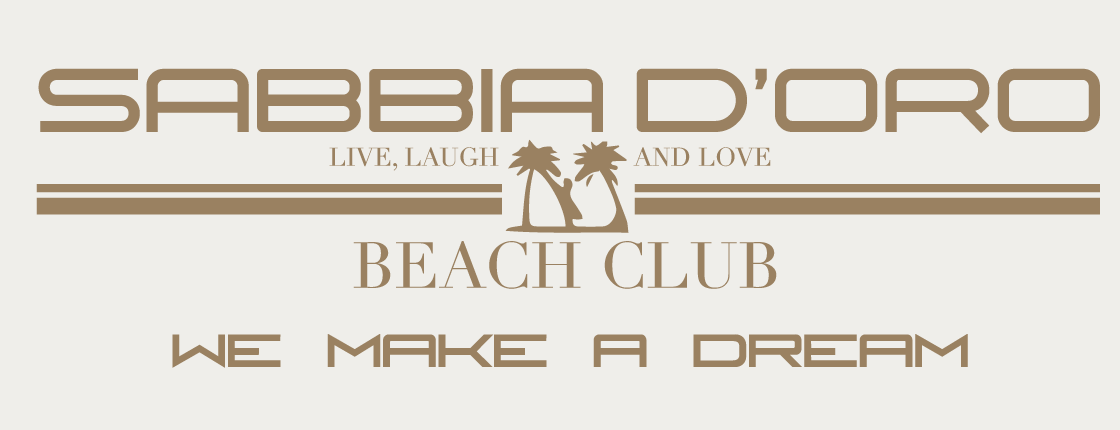
The wide geometric name, serif “Beach Club”, two slogans, palm icon and rules each have their own style and weight. At a glance, there is no obvious order after the name.
At the width available in a website header or social profile, the smaller slogans and fine lines become difficult to read. The complete composition needs more room than those surfaces give it.
Palms and dream-led language signal a beach holiday, but say little about Sabbia d’Oro’s own entrance, setting or Ionian coastline.
Both full marks are shown at the same width. The proposal also has a symbol that can be used on its own where a complete name would be too small.
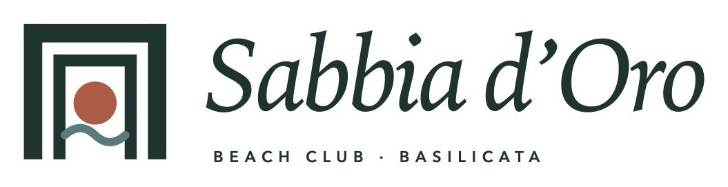
The working portal mark takes its shape from the square timber frames on the approach to the sea. A terracotta disc holds the sun; one restrained curve suggests the water. Together they make a place-specific sign without drawing a literal beach scene.
Nested frames echo the route into the venue and make a recognisable silhouette.
A single warm disc gives the mark a focal point without another slogan.
One gentle swell brings in the Ionian water while keeping the mark simple.
Deep green, warm sand, terracotta and sea green come from the approach, light and coast. An expressive serif gives the place a voice; a quiet sans serif carries practical information.
The old page had useful booking links and a recognisable name. But its opening spent most of the screen on the logo and empty white space. The beach appeared as a small promotional panel, while the introduction began as a tight block of text below. That ordering delayed the answer to the guest’s first question: what will it feel like to be there?
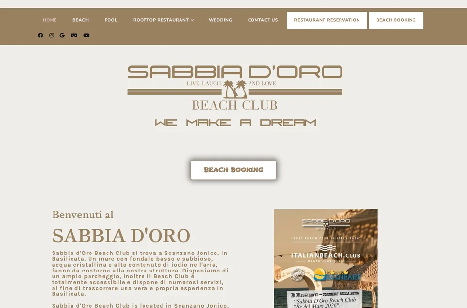
The largest visual element is the logo; the beach itself does not establish the first impression.
Beach booking is available, but there is little surrounding imagery or offer detail to help someone decide which experience is right.
A compact paragraph and a small, busy image carry too much of the story. Page hierarchy, spacing and image scale do not help visitors skim for the essentials.
Recorded during the concept study; it documents the earlier presentation, not the current state of the business’s site.
The proposal opens on the beach, names the location and gives beach and restaurant bookings a clear role next to the experience. A larger headline establishes a point of view; the supporting sentence explains what is here. The first screen becomes an invitation and a useful decision point, rather than a preamble.
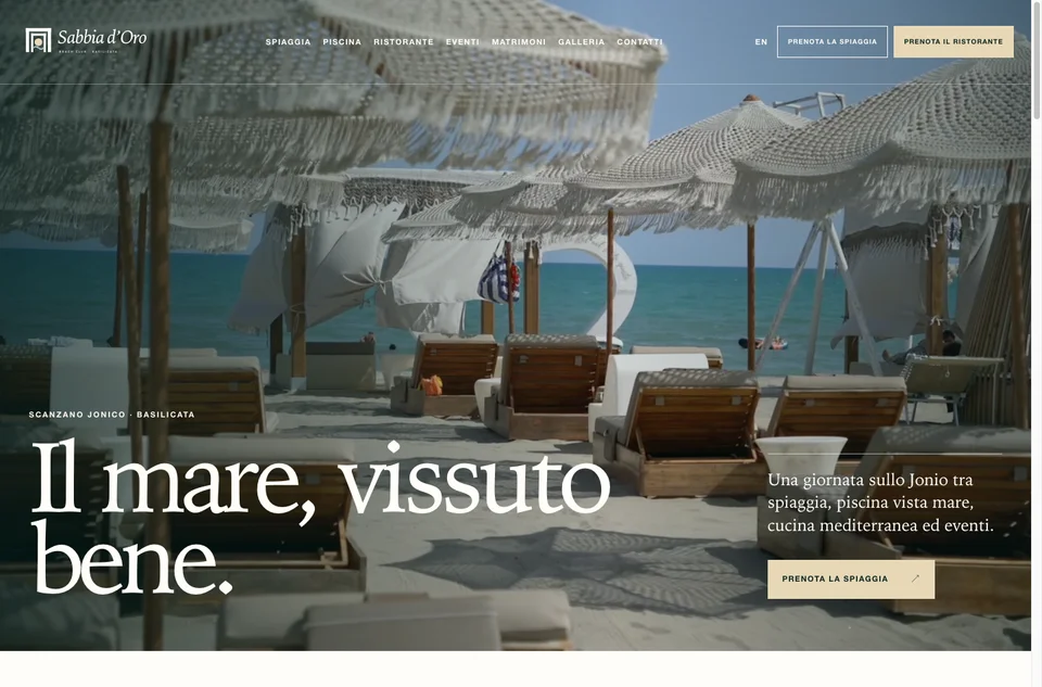
The full-bleed image or muted film shows the setting before the visitor has to interpret a paragraph.
Location, headline, short context and booking action have distinct jobs and are readable in order.
Beach, pool, dining, events and weddings each have a route and practical next step within one visual system.
These are design-study captures, not a before-and-after launch result. The proposal has not replaced the business’s website.
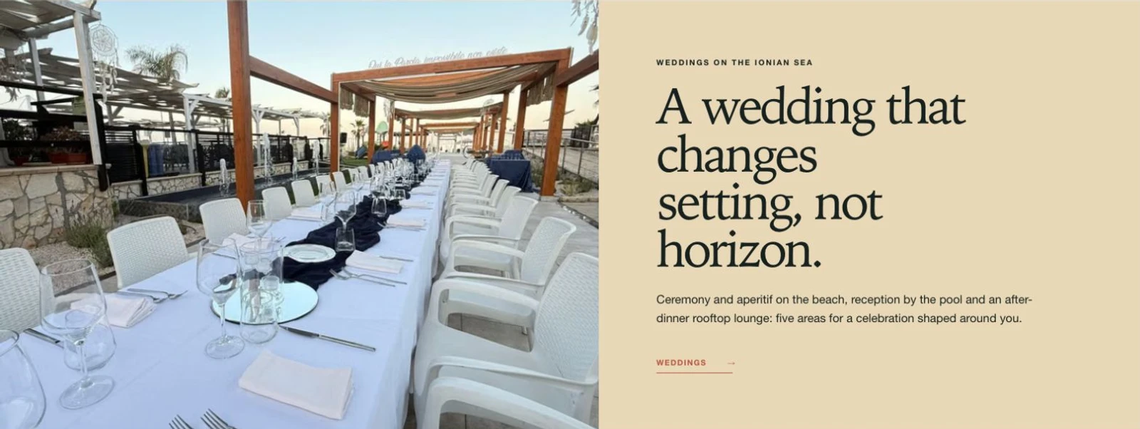
The weddings section gives celebrations an image, a proposition and a route of their own. It still feels part of Sabbia d’Oro, rather than a separate microsite or another long list of services.
Movement can establish the energy of a day on the coast, but it should never carry essential information by itself. The prototype uses a muted hero film with a still poster, keeps the booking actions outside the video, and lets reduced-motion or data-saving visitors see the same clear page without autoplay.
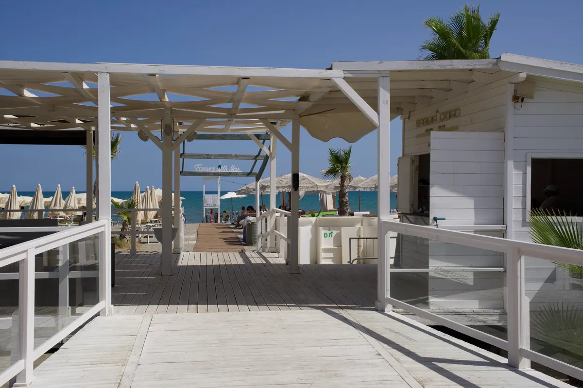
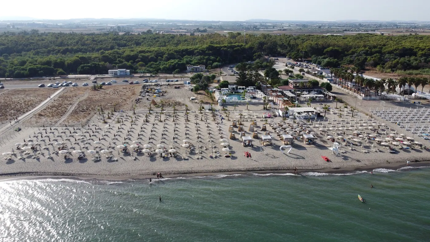
The local prototype explores the guest journey across the main sections of the venue. Italian and English content are written separately, and the content model gives the team places to manage pages, imagery, events and menus. Booking actions connect to the venue’s existing routes rather than implying that a new booking system has been built.
Tell me what people come to you for, and where your current website makes that journey harder than it should be.