 Luca Giorgio
What to take away
- Help someone understand what kind of business you are before they contact you.
- Carry the same character through your identity, photography, words and website.
- Build trust by making the real experience match the expectations you create.
Imagine you are looking for somewhere to eat in a town you have never visited. You search online and open a few restaurant websites. None of the names are familiar. You are deciding where to spend your evening from what you can find on the screen.
One site has grainy photographs, a menu you have to zoom in to read and unclear opening times. You cannot tell whether the place is relaxed and family-friendly or designed for a formal evening.
Another shows you the dining room, gives a clear introduction to the food and makes it easy to check the menu and book. You can start to picture yourself there.
You have not tasted a single dish, but one business has already given you more to feel confident about. The first restaurant might have an excellent kitchen; its website has left you with unanswered questions.
That gap is where branding becomes useful. It helps the quality and character of a business come across before someone has experienced it for themselves.
The first impression starts with the clues you give
Before someone reads your story, they can see the photographs, the amount of space on the page, the typography and the way information is arranged. Those details begin to set expectations.
Research by Tuch and colleagues found that visual complexity and familiarity influenced how people rated website aesthetics after very brief exposure. The study measured reactions to screenshots; it does not prove that an attractive website earns trust or wins a booking. My practical takeaway is to make the first view clear enough for someone to want to keep exploring. Read the research on website first impressions.
For a small business, I would start with three questions: What do you offer? Who is it for? What makes the experience yours?
A warm photograph of a busy family table and a clear introduction to local cooking say something different from a quiet dining room and a carefully presented tasting menu. Either can be right. The useful choice is the one that reflects the actual business.
Give the identity something meaningful to express
A logo becomes more useful when the business behind it has a clear point of view. Decide what you want people to remember and what you can consistently deliver.
For an imagined coastal restaurant, that might be “unhurried lunches, seasonal cooking and a welcome for the whole family”. That gives us something specific to work with:
- Photography: shared dishes, people around the table and the setting at lunchtime.
- Words: direct, warm descriptions of the food and the visit.
- Design: readable menus, comfortable spacing and colours that belong to the place.
- Website: clear opening times, practical family information and an obvious booking route.
The identity brings those decisions together. A new symbol on its own would leave most of that work unfinished.
A good first impression makes a promise. The experience that follows needs to keep it.
Recognition grows through the everyday details
Someone may meet your business through a social post, a recommendation, a search result, an email or the sign above your door. Each encounter should help them recognise the same place.
Consistency leaves room for variety. A menu and a website have different jobs. They can share a few dependable elements: a recognisable mark, a small colour palette, a way of writing and a consistent approach to photographs.
Here is a hypothetical restaurant example:
| Where someone meets you | A detail worth connecting |
|---|---|
| A social post | Photographs and language that reflect the current experience. |
| The website | The same identity, with a clear explanation of what to expect. |
| A booking confirmation | A familiar tone and accurate details for the visit. |
| The menu and the welcome | The character and care that the online experience promised. |
These are practical decisions. If your website promises personal hospitality, a helpful confirmation and a thoughtful reply can carry that promise forward.
Let the place give you character
One reason I want to work with Italian businesses is the amount of character already there: the people, the landscape, the food and the way a place welcomes you. I want more of that quality to come through online, including for visitors discovering it from another country.
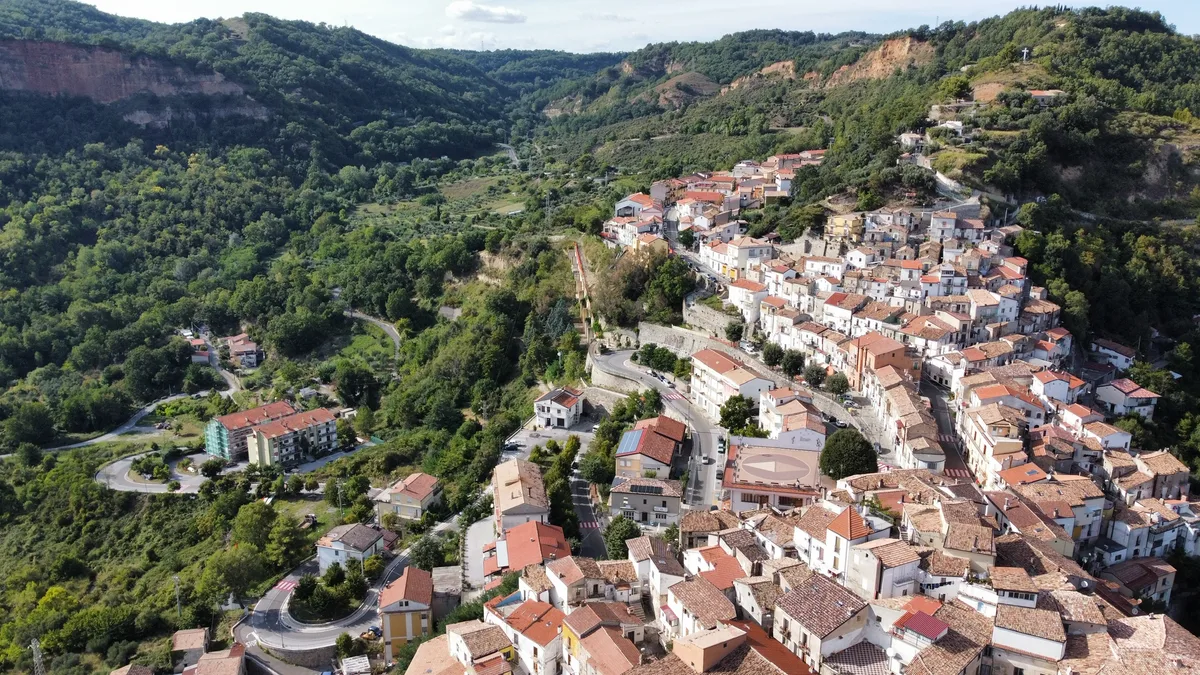
Modo Vivo's own colours draw on my connection to Basilicata. Sea, stone, rooftops and sunlight became references for the identity. Your references might be completely different: a family craft, the rhythm of your kitchen or the material you work with every day.
Choose details you can explain. They give a designer a stronger foundation than trying to look like whichever brand happens to be fashionable.
Try a fifteen-minute first-impression check
Put your homepage, a recent social post, an email and one printed item beside each other. Then ask someone who does not know the business to look at them.
- What do they think you offer, and who do they think it is for?
- What kind of experience would they expect?
- Which details make the materials feel connected?
- What feels unclear, outdated or inconsistent?
- Can they find a sensible next step without your help?
Listen before explaining your intentions. Their answers can show where the presentation and the business have drifted apart. This is a useful conversation starter, rather than a substitute for research with your actual customers.
Start with the gap that matters most
You may already have an identity worth keeping. Better photographs, clearer writing, an updated menu or a more usable website could do more for the immediate experience than replacing everything.
If the business has changed substantially, the positioning and identity may need a deeper review. Work through the purpose, audience and promise first; then decide what the design should express.
The aim is a business people can understand, recognise and feel comfortable approaching. If you are unsure where the gap is, explore how Modo Vivo connects branding and design. If a website is the next step, the website preparation guide will help you gather the right ingredients.